Case study
Mobile Travel app design
Summary
Designed a mobile travel app to help
travelers with specific health and/or identity needs

more easily find places at their destination (via crowd-sourced reviews from other travelers with overlapping needs) where they feel safe and able to immerse themselves.
Executed independently within 5 weeks
Used Figma, Figjam, Google docs, Procreate, and Photoshop
Assignment
-
To design a mobile app that helps users with planning travel in a “post-covid world.”
-
I had recently observed friends who are immunocompromised struggling with finding lodging, restaurants, and activities while traveling that felt safe for their health.
-
This inspired me to design an app to help people like them more easily plan their travel.


User interviews
Affinity diagram
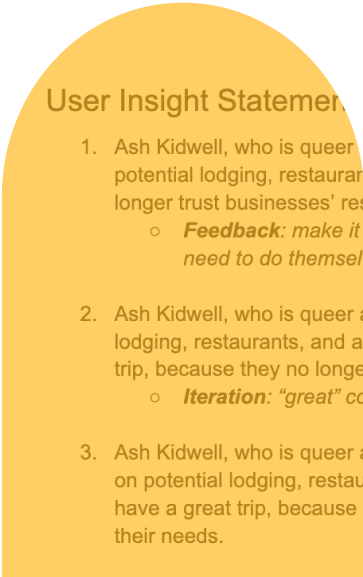
User insight statement
User persona
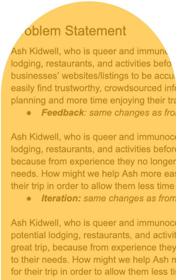
Problem statement
Feature prioritization matrix
Value proposition canvas
User journey mapping
Storyboarding
I like, I wish, What if
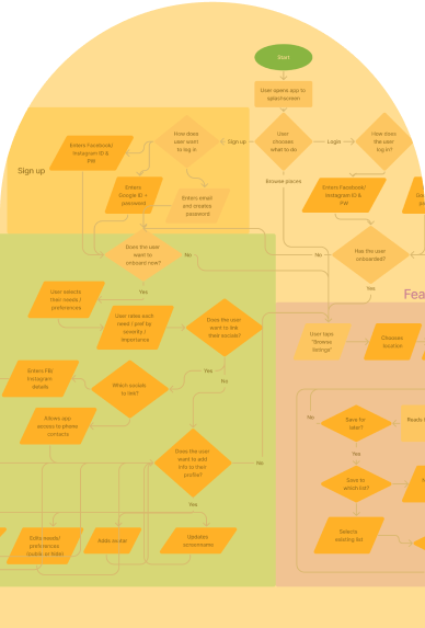
User flow mapping
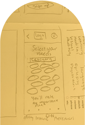
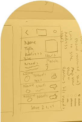
Wireframing
Prototyping
Remote moderated tests
Remote unmoderated tests
Iterations
Research

Starting hypothesis
Going into my research, I expected that travelers with specific needs, particularly around disability and health conditions, would need the app to provide
net-new functionality
from existing apps.
Examples:
-
Info on traveling with medications
-
Accessing medical services or medications abroad
-
Government requirements for traveling to prevent transmission of Covid-19
User interviews
I screened for interviewees with
extensive travel experience
and
specific needs that are difficult to research for.
I conducted 5 user interviews that consisted of 21 set questions, specifically around:
-
Strategies for researching travel they currently use
-
Their ideal planning experience
-
Pain points before and during travel
-
How they want to feel during travel
Definition
By creating:
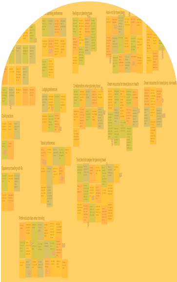
Affinity diagram
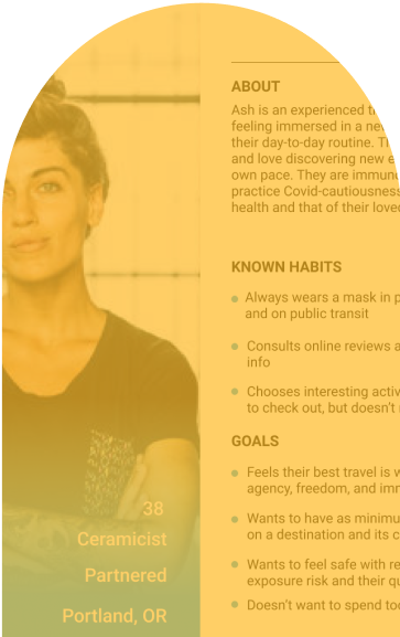
User persona
User insight statement
Problem statement
I found that my initial hypothesis was wrong:
Instead of providing net-new functionality, I needed to provide an easier means to locate and centralize
existing information and functionality.
Ideation

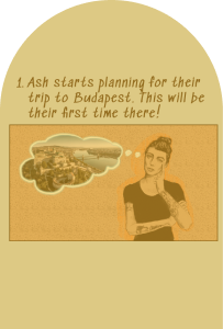
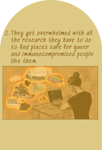
Storyboarding
-
Leveraged the user persona as a through-line in creating a storyboard which addressed the defined problem statement
-
Realised not all parts of the problem statement were addressed in the storyboard, so then added one more user scenario
-
This enabled honing in on the most essential app functionality
Brainstorming
Now that I had a firm sense of what experiences the app needed to provide, I leveraged:
-
I like, I wish, What if
-
Feature prioritization matrix
-
Value proposition canvas
-
User journey mapping
This led me to understand I needed to build a platform on which users could:
-
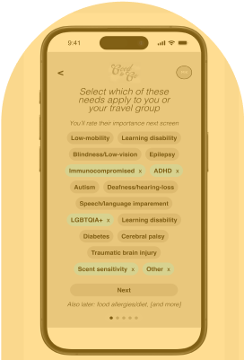
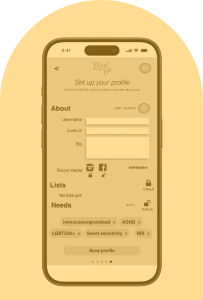
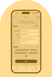
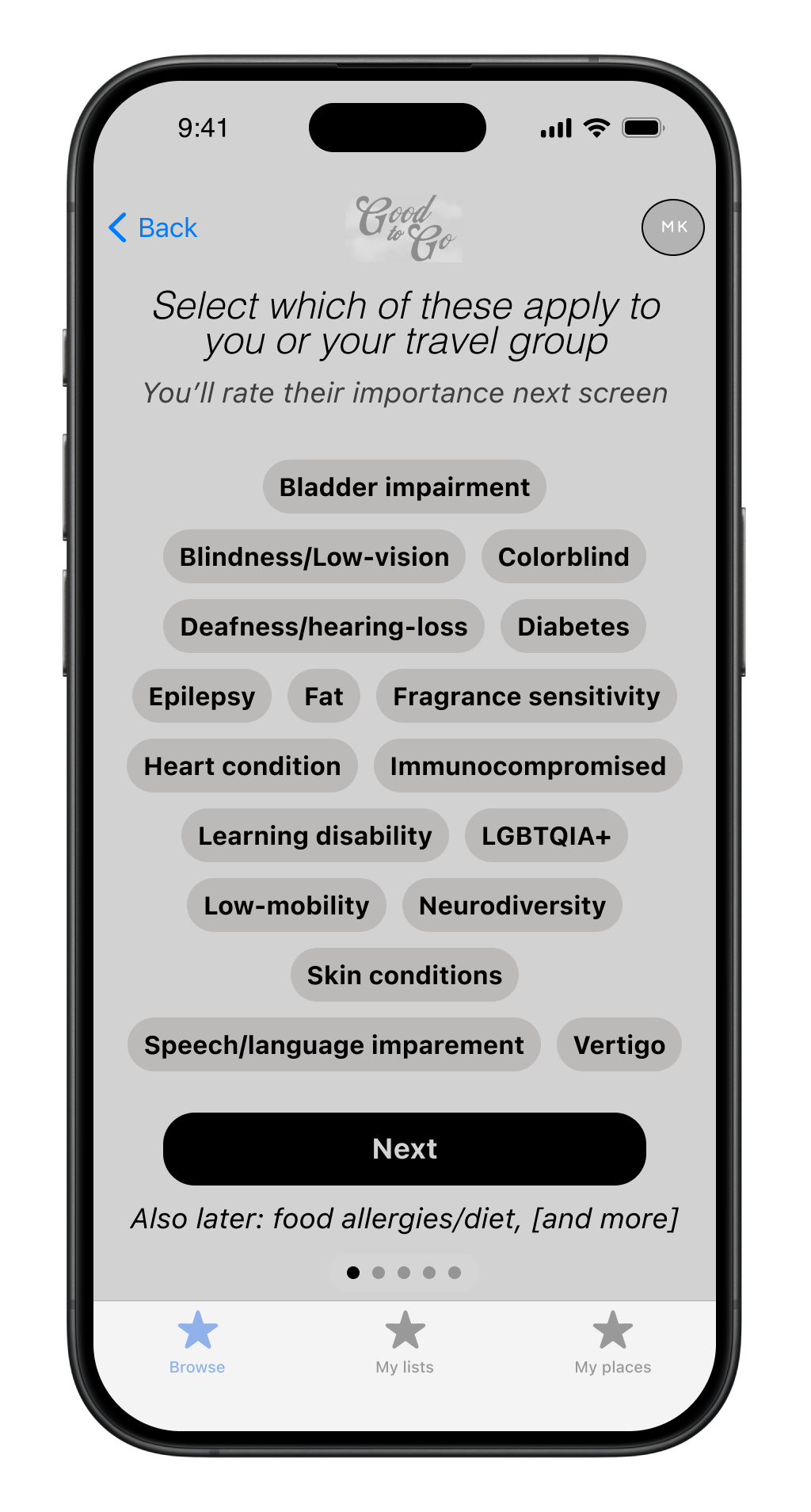
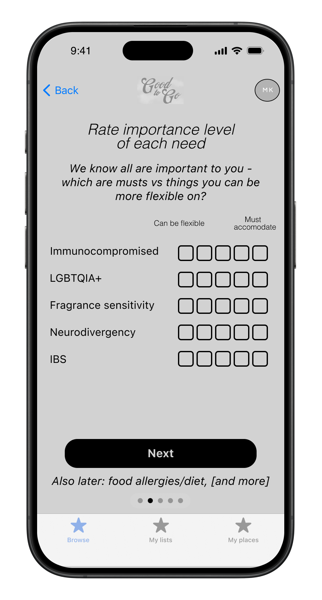
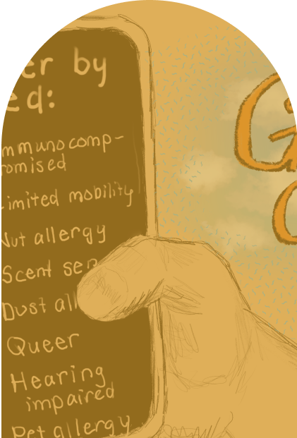
Set up accounts
saved with their health conditions, disabilities, and identities as tags
-
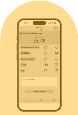
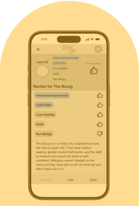
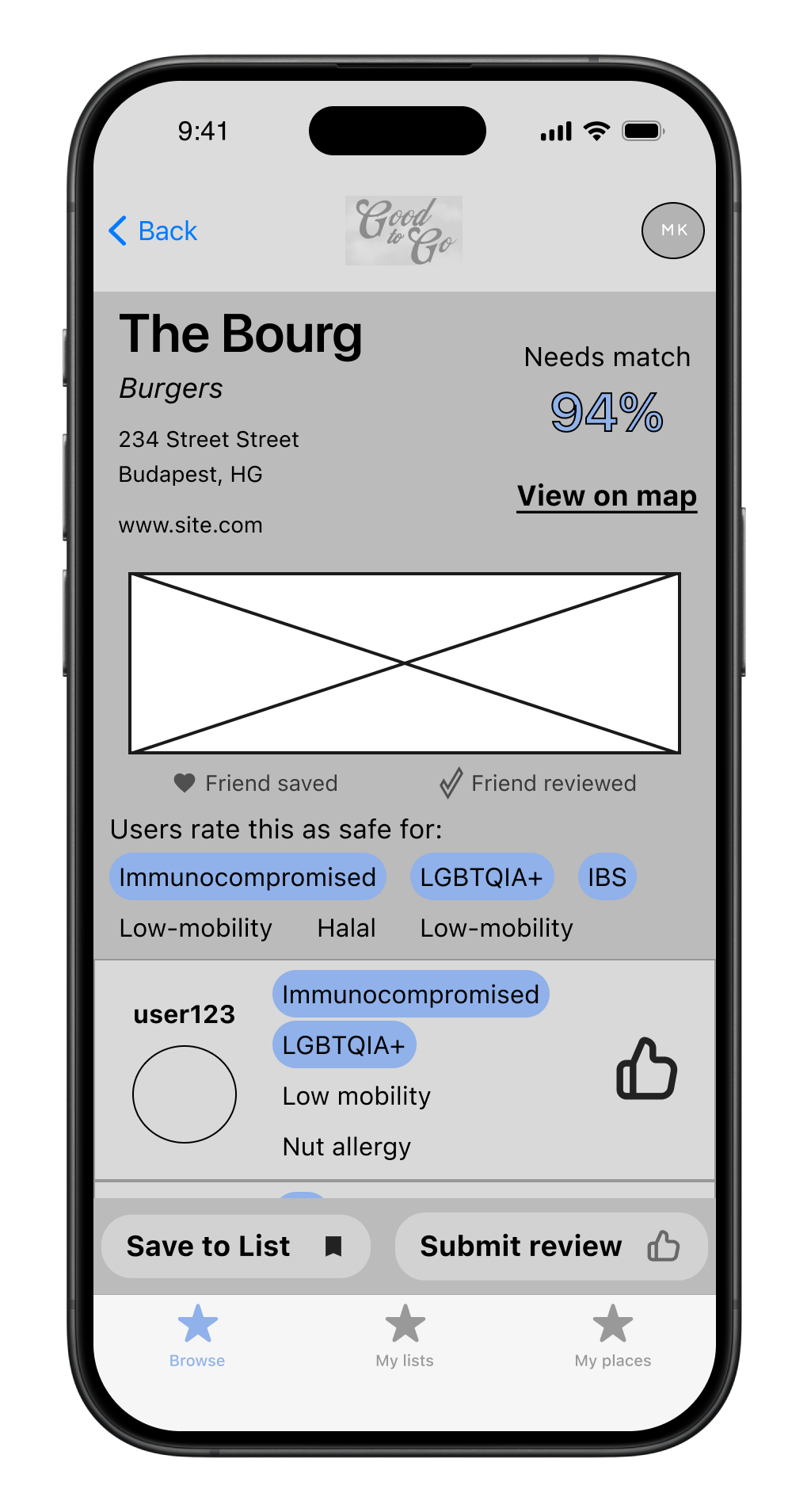
Submit reviews
of businesses based on their tagged attributes
-
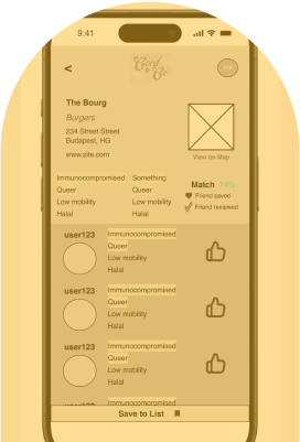
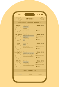
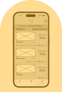
Browse for businesses at travel destinations
which are prioritized in search results based off reviews from travelers with overlapping attributes